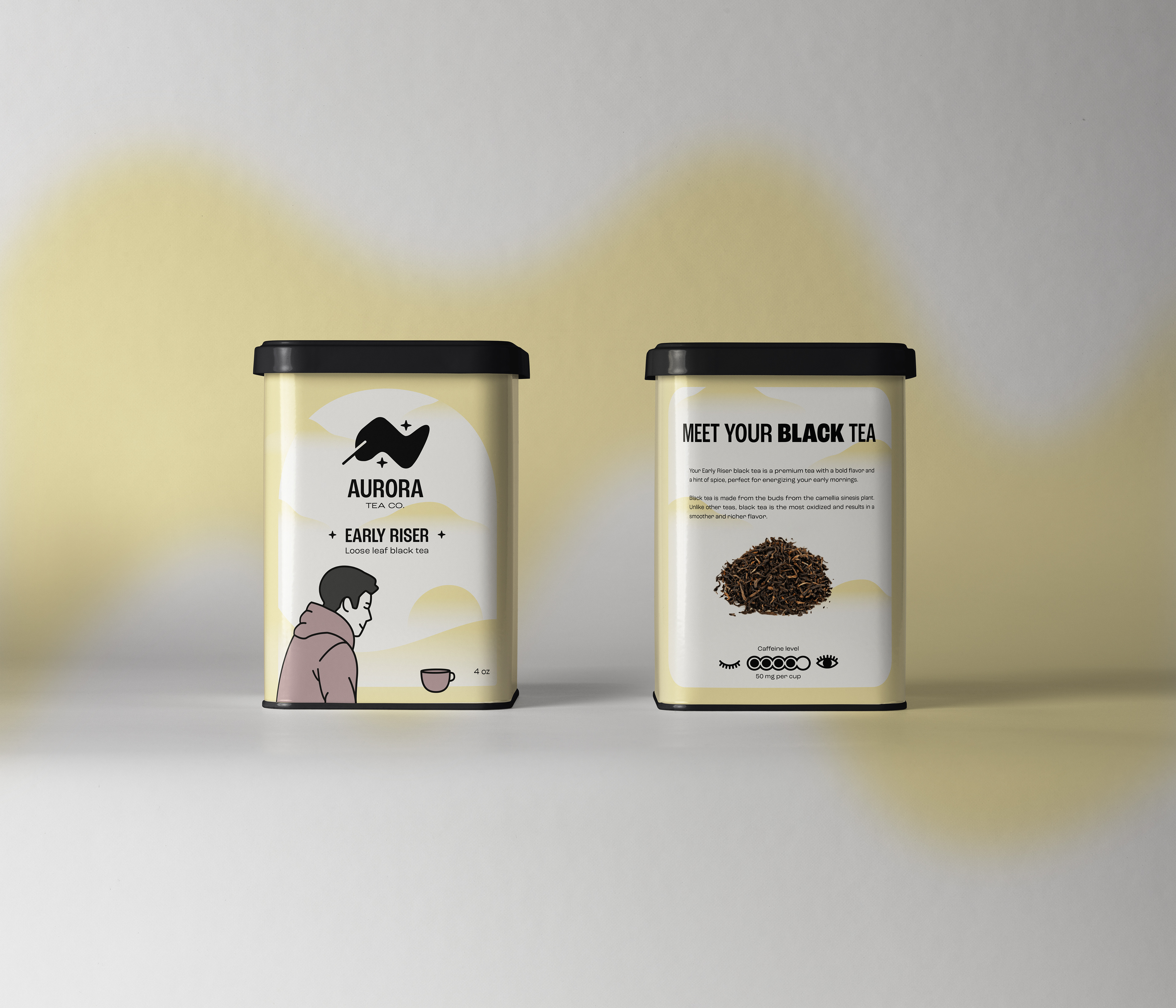
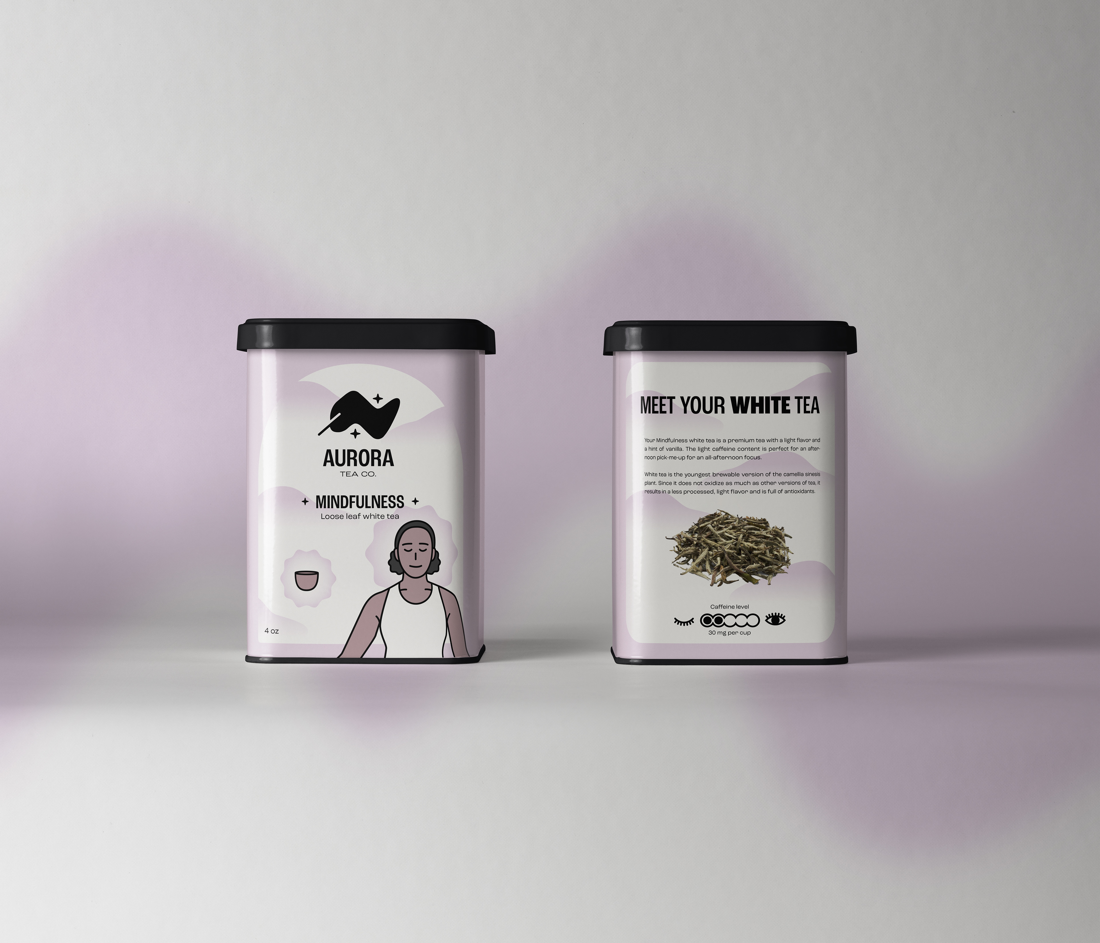
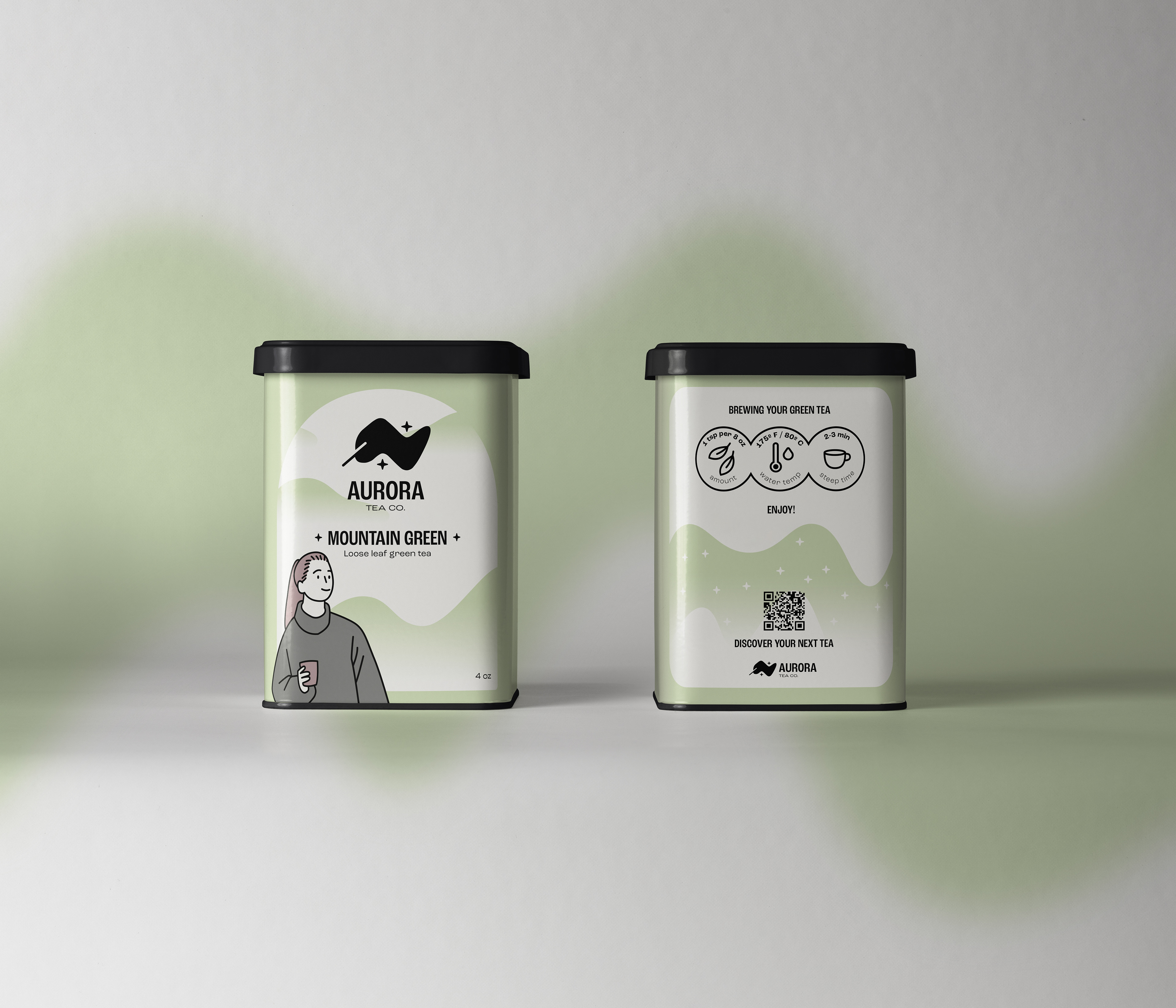
AURORA TEA CO. — 2024
Context: Aurora Tea Co. is a self-directed project built on my deep love for tea. My goal was to create the ideal premium tea brand that could meet the needs and desires of any tea drinker, focusing on the individual.
Process: After brainstorming ideas for names, I landed on Aurora. Inspired by the breathtaking Aurora Borealis, with a light, almost liquid-like appearance, and a shape that reminded me of a freshly brewed tea, it became the perfect name. To match the name, I then designed a logo combining the form of an Aurora with a tea leaf, pairing it with a friendly Sans Serif to match. Knowing that I wanted to focus on illustration with this project, I started with sketching the individuals representing those who’d be enjoying each flavor. My focus in the illustrations was to keep the brand as approachable and welcoming as possible. Once the pairs of flavors and illustrations were complete, I researched each tea’s flavor profile, benefits, and brewing instructions. Lastly, I focused on creating a consistent visual for the brand across all packaging and advertisements.
Solution: Using friendly illustrations, clear instructions, and descriptions of the teas, the brand focused on the importance of the individual, creating a welcoming environment for both experts and beginners.
