LIFT — 2024
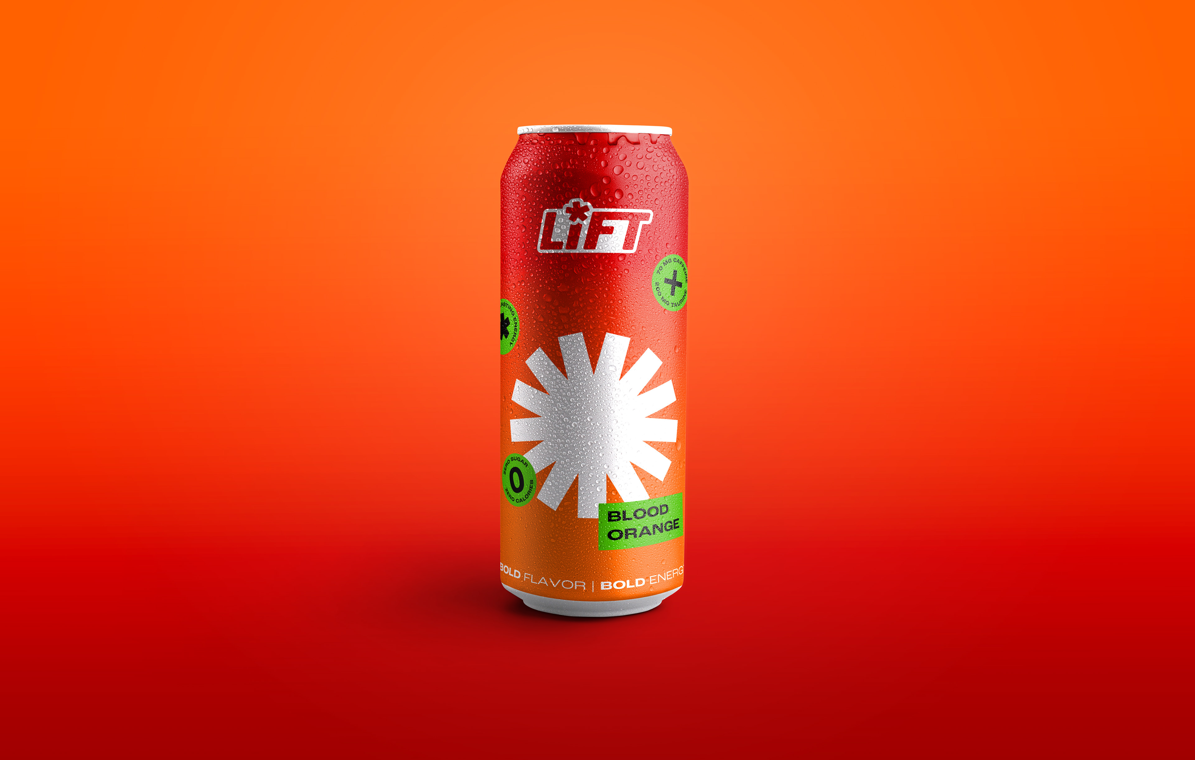
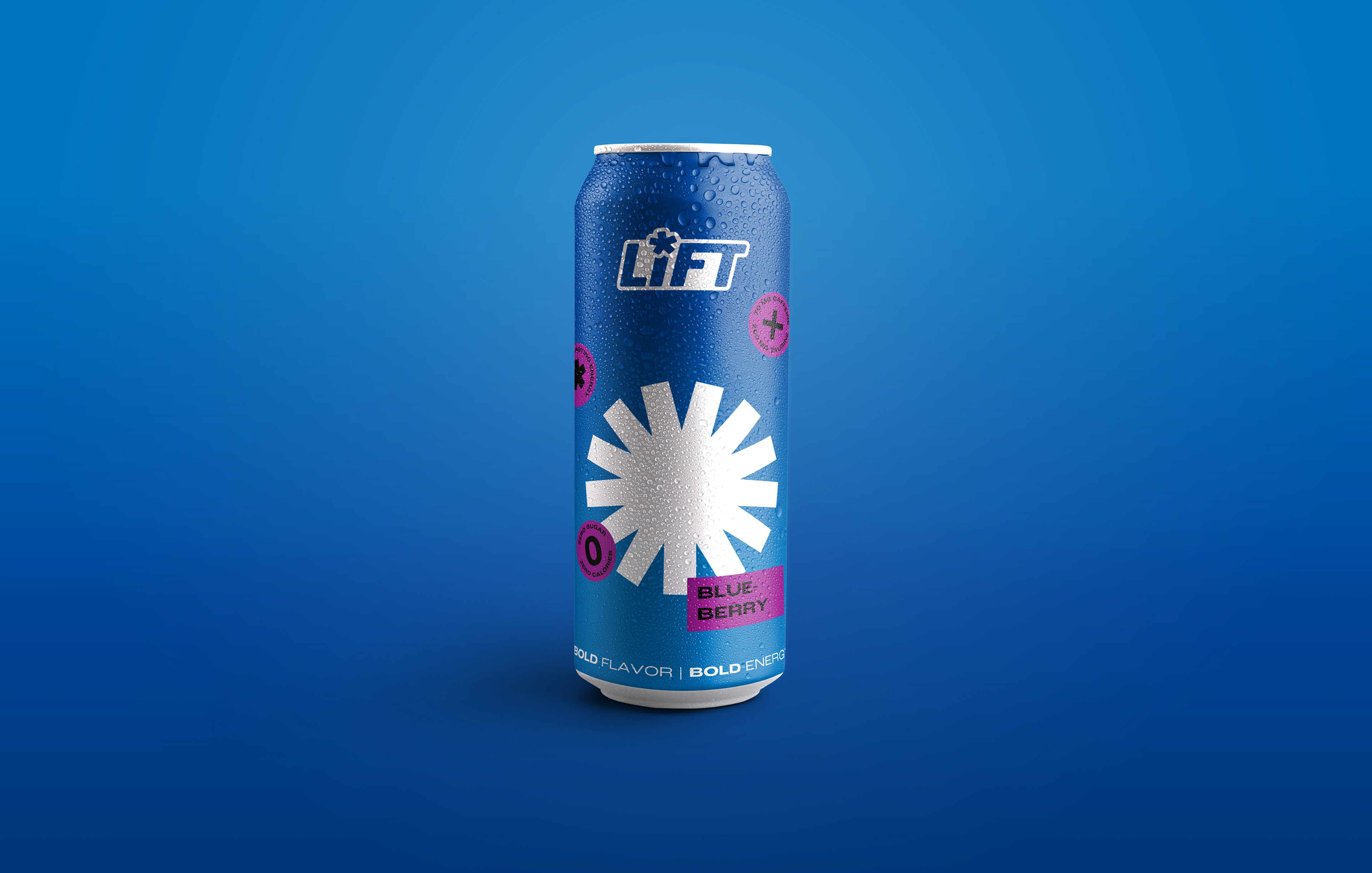
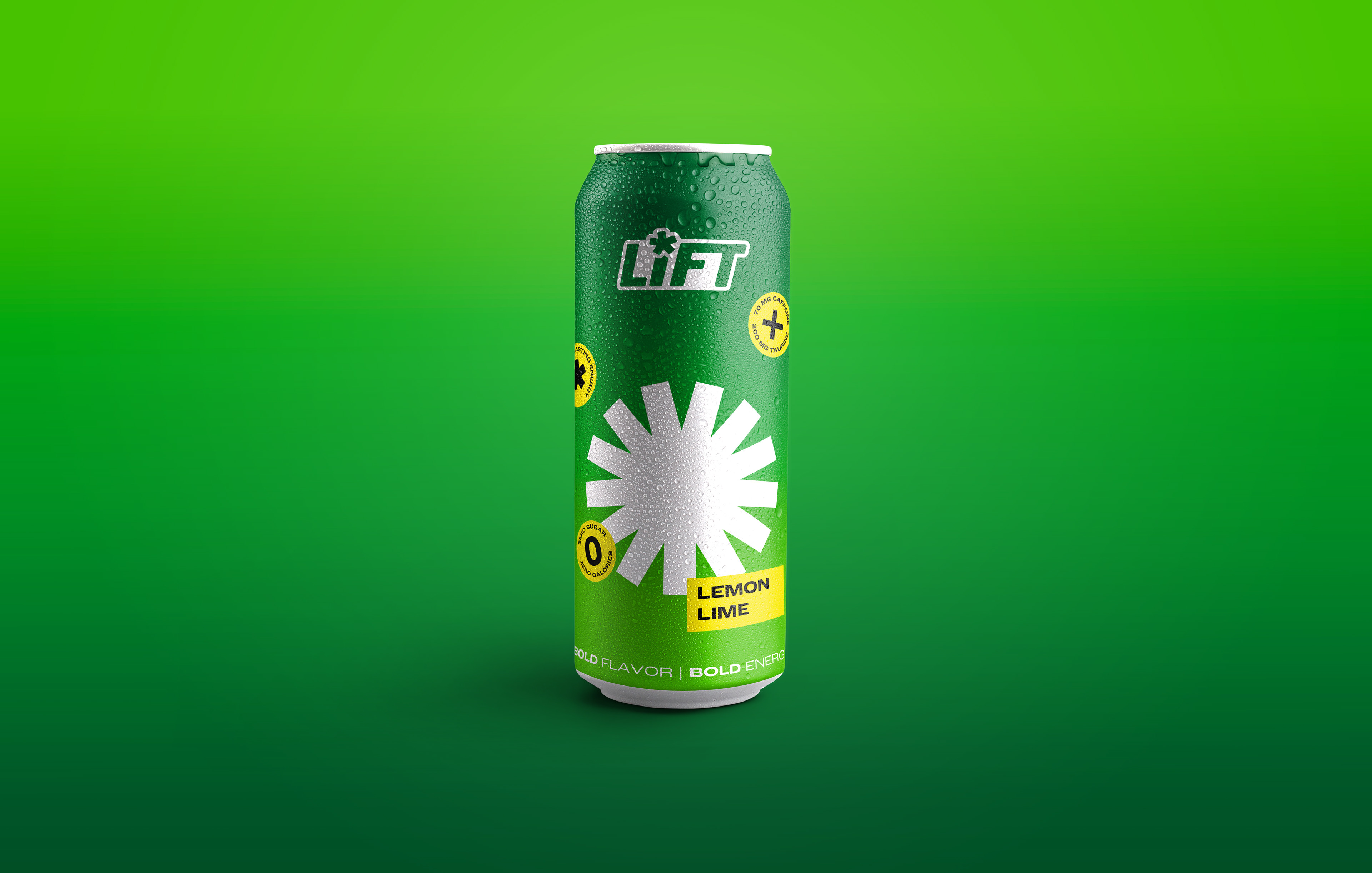
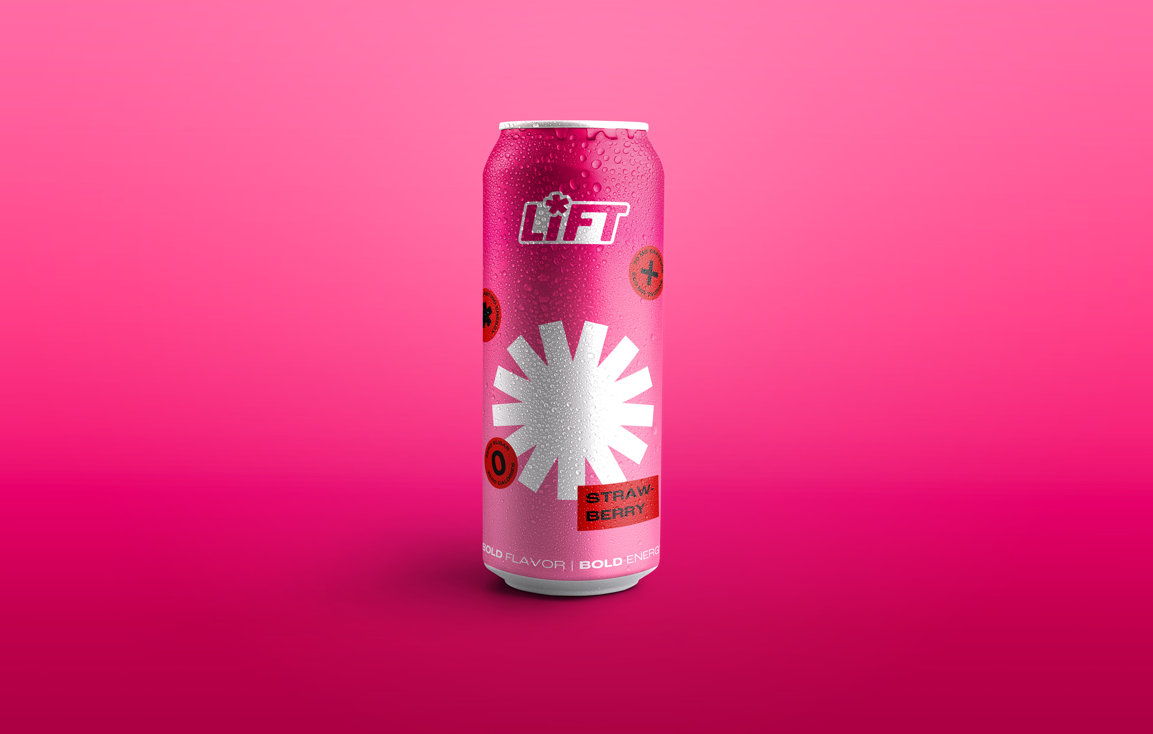
Context: Lift is a self-created brand of energy drinks with aims to match their bold flavors, caffeine, and taurine content, with an even bolder design concept. While creating the concept for this energy drink brand, I focused on one thing: Be louder and higher energy than everything else on the shelves.
Process: After collecting inspiration behind the chosen colors and flavors, I played with names for the brand, ultimately landing on Lift. Short and concise, suggesting a drink that can give you a needed “lift”. I had sketched out several options for logos and branding, resulting in a simple type logo paired with the bold, squared and sharp star shape that would be a main visual for each can. The highlight of each can would be the harmony between sharp shapes, bold text, and a smooth color interaction between the foreground and background. I, then, used that same visual language to create poster and billboard advertisements.
Solution: By using bold shapes and colors, I illustrated the high energy and bold flavor of the energy drink cans. These bold cans would stand out, catching the eyes of any and all people needing a lift.
